9 Communication Techniques in Art and Design
Have you ever had a brilliant idea for a design but have no idea how to get it out of your head and onto the page/computer screen? This was the problem I had for years. My head was a jumble of ideas that I could not communicate and therefore could not do much with. This is where knowledge about the various communication techniques in Art and Design comes in handy!
This may seem like a very theoretical subject, but it is fundamental in the interior design journy. The information has formed the basis for how I communicate my interior design ideas (just ask my poor builder who once received this drawing as the basis for setting out our garden as part of our kitchen renovation…he later told me it is upside down too).
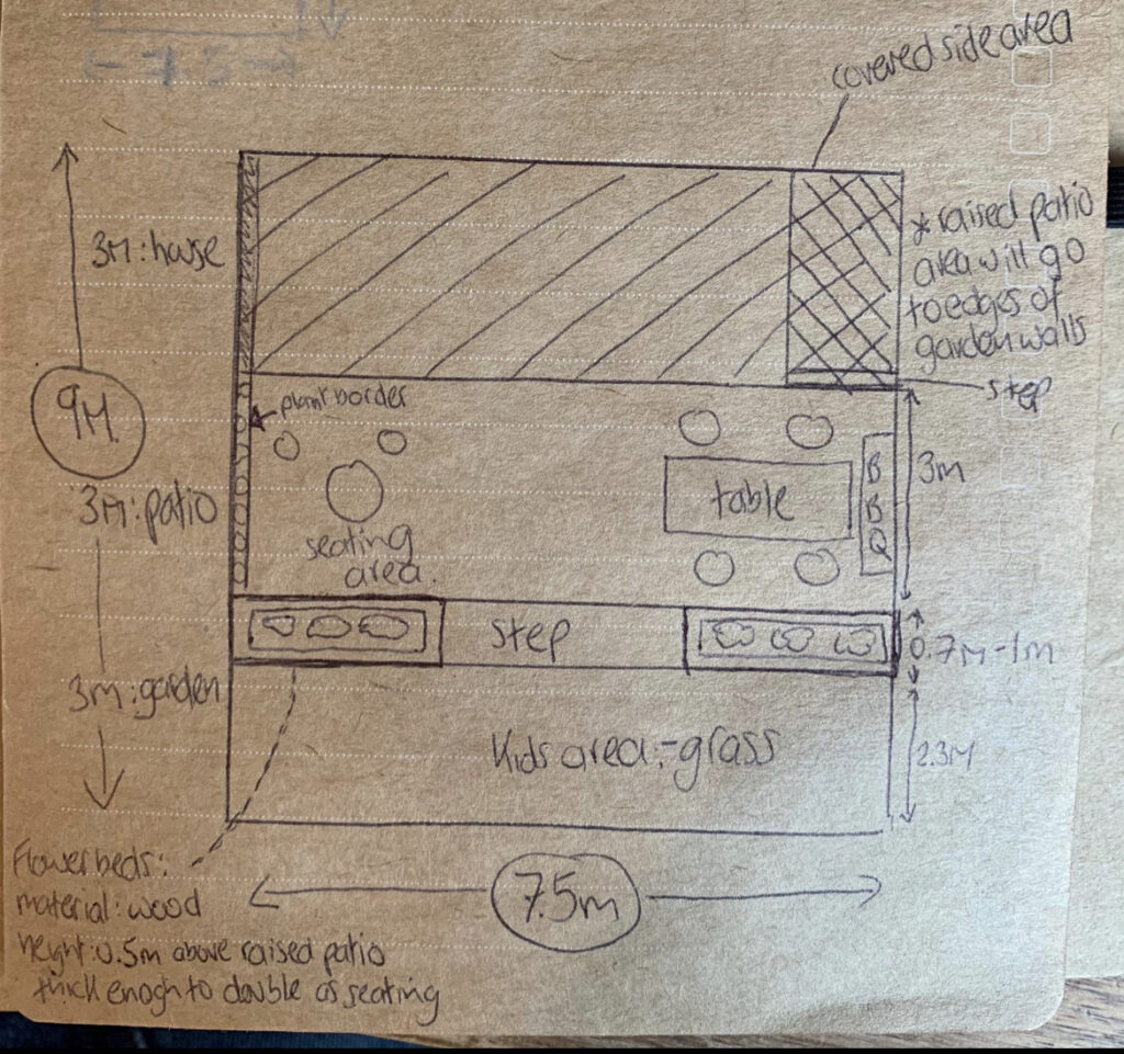
This is the very good reason why communication techniques used in Art and Design is the first topic covered in my Interior Design HND course with the British Institute of Interior Design.
This project also opened my eyes to historical and contemporary design and architecture, and how techniques have changed over the years.
This post is for anyone wanting more information on the different communication techniques used in Art and Design, the historical and contemporary types of communication techniques and a guide to what techniques are useful for each stage of a project (which will be really helpful if working with an architect on your home design).
What are the Communication techniques used in Art and Design?
The various communication techniques used in Art and Design are used throughout an interior design project, and the technique you should choose depends on the stage of the project you are at.
The main communication techniques are as set out, andI have put them roughly in the order you are likely to see/use them in an interior design project.
I have also included some examples, a mixture of iconic and beautiful architecture and interior design, and some of my own drawings. Needless to say, it will be easy to spot the difference – but you are on this learning journey with me after all!
1. Concept boards
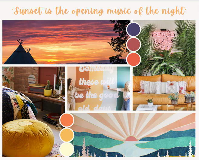
Concept boards can be used at any stage of an interior design project, however they are most commonly prepared at the initial stage, after the client brief. They are also known as inspiration boards, and provide a valuable touchpoint when progressing through the design process.
I love creating concept boards as it is an expressive and experimental process. Sometimes I will have an idea of colours and concepts beforehand but I love it when inspiration hits during the creation of these boards. For example, when designing my friend’s living room, I was researching her love of music and Glastonbury festival when I came across a beautiful photograph of the Glastonbury sunset that formed the basis of the whole design.
2. Sketches
Sketches are not technical drawings and allow designers to create freely. They can be prepared at any stage of a design, and are great for recording quickly when inspiration hits.
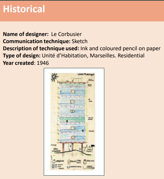
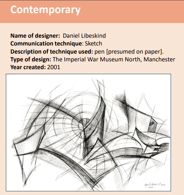
Libeskind’s sketch appears to have been drawn at the ideas stage, showing the shards of a broken Earth emerging and is a conceptual design. On the other hand, Le Corbusier’s sketch appears to have been prepared at a later stage, showing the defined shape and how the space will be used and is an observational design.
3. Sketchbooks
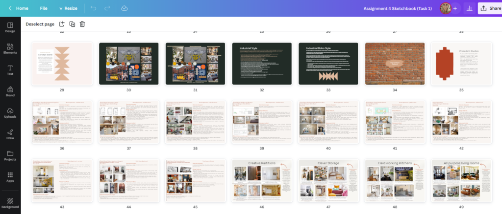
Again, sketchbooks are normally used at the start of an interior design project but can be a useful communication technique throughout the project. Sketchbooks are a collection of sketches, samples and images, and are brilliant for documenting the creativity process. They can be produced manually or digitally.
For my course I have been producing digital sketchbooks using Canva, and love the way that they act as a diary of the design journey from the initial brief to the final presentation package.
4. Sample boards
Sample boards are different from concept boards as they show the final selection of materials to be used in the design. They are prepared once all the research into the furniture, fixtures and Equipment (FF&E) has been done and you are ready to bring the final selections to your client, or use them for your own project.
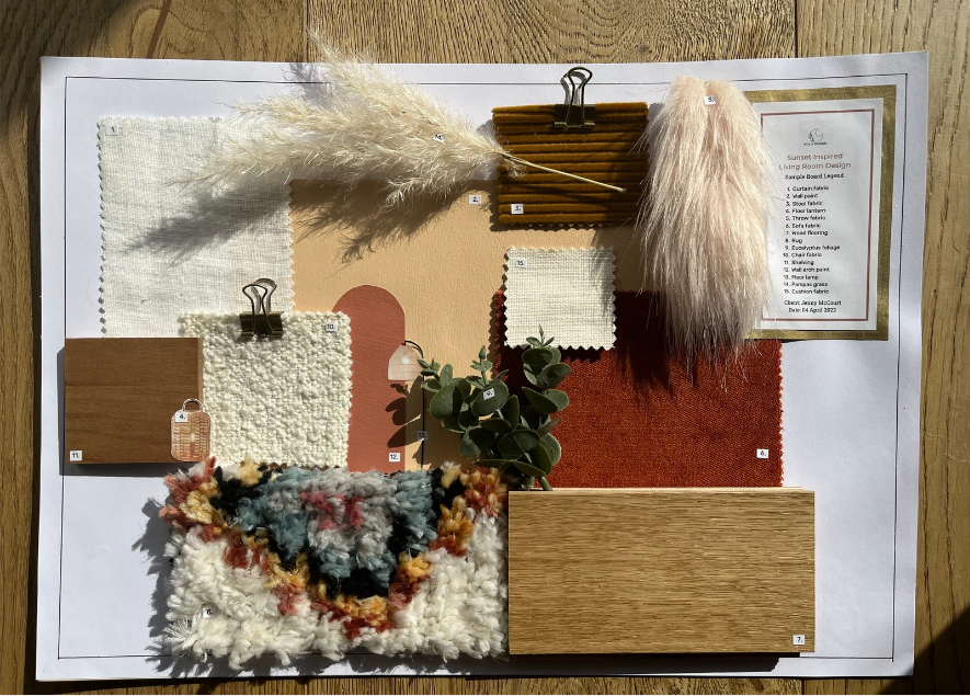
Samples boards are one of the only communication techniques in Art and Design that can not be replicated better using computer-aided design (CAD) programs. The boards are tactile and rich in texture, and it is important to understand how a material feels before putting it in your space. Seeing the actual materials in the actual space is key, as they can react differently depending on the light in the room. I would always bring a sample board to a client’s home before finalising the design.
5. Floorplans
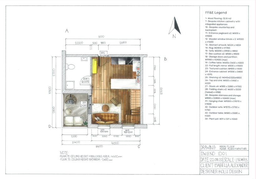
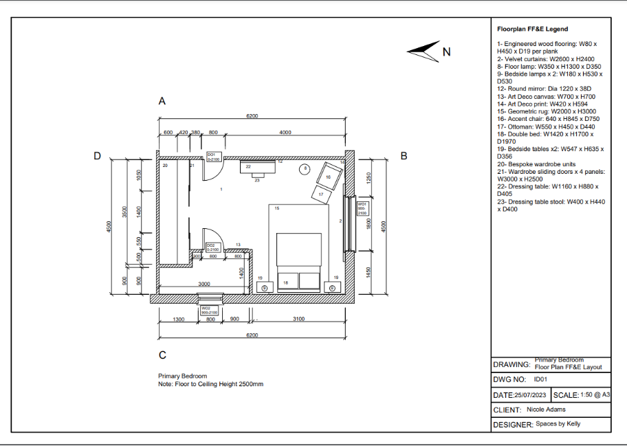
A technical floor plan is a 2D drawing of the building, room or space to scale, and shown from above. You can think of it as an imaginary horizontal line cutting through the space around 1 metre above floor level.
In recent years, technical drawings such as floor plans are more often created using CAD, as this saves a lot of time and increases accuracy. Here are two of my floor plan drawings, the first done by hand and the second done using AutoCAD. You can see the difference, and I can see the pros and cons of using both.
6. Elevations
Elevation drawings are 2D representations of the exterior of a design. Elevations are scaled technical drawings, providing a great visual of the design. Elevations do not show perspective and can show one or multiple orientations.
Examples:
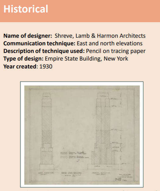
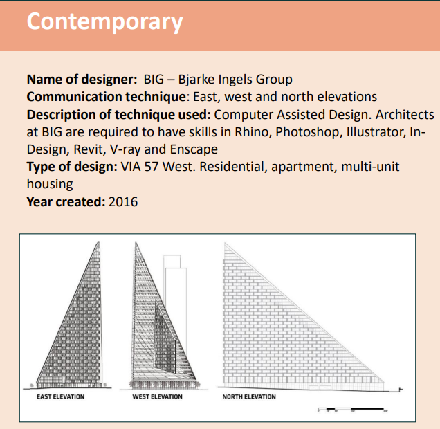
The above drawings show various elevations, which are extremely useful as they give a more holistic view, and communicate how the buildings’ impact changes based on the viewer’s position.
7. Sections
Section drawings illustrate a cut-through of a design, and are a great way to show the relationship between the interior and exterior. The drawings should be to scale (which are much easier to produce using CAD rather than drawing by hand) and communicate technical features such as the position of walls or supporting structures.
Examples:
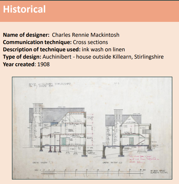
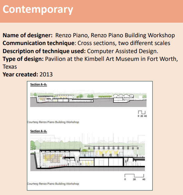
Designers can show cross-sections from different angles (Mackintosh) or different scales (Piano).
8. Detail drawings
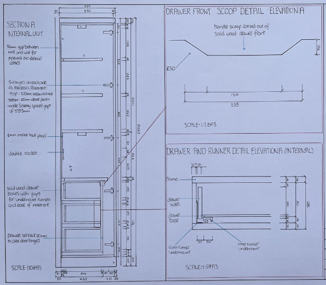
Another highly technical communication technique used in Art and Design, the detail drawings are created in later stages of the design process and show the finer details of a design, at a larger scale.
These drawings are very useful if you are designing a bespoke piece of furniture for the space and need a joiner to understand every little detail so they can make it to your exact specifications.
Here is a detail drawing that I drew for a bespoke larder design:
9. Rendered perspective drawings
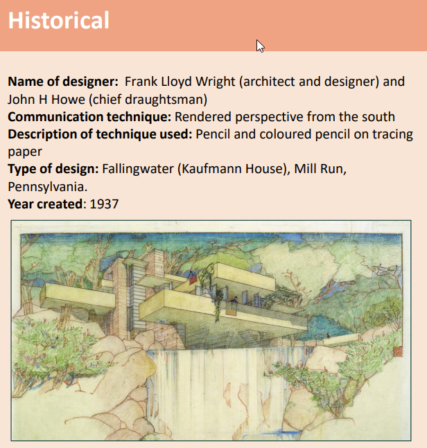
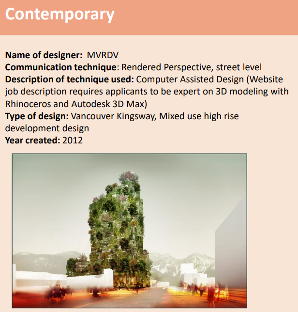
Rendered perspective drawings are an important communication technique in art and design between designers, their clients and the wider public. They bring a design to life, conveying how it will look in its environment, and showing the form, scale and materials in 3D.
Rendered perspectives ask the viewer to share in the designer’s vision and in both these drawings it is clear that the vision is one of respecting nature and creating a space for people to be at one with their natural surroundings. They are the drawings that are going to appeal most to a client and a professional rendered perspective drawing can make all the difference in securing the job.
Examples:
So there they are – the 9 amazing Communication techniques used in Art and Design!
I hope that after reading this you will now feel inspired to create a concept board for a tired room in your home, or will feel less overwhelmed when your architect sends across lots of different technical drawings for you to approve.
To read more about me and my interior design journey so far please have a read of my About Me page
