Our Hallway Design Part 1: The Staircase
When we moved into our Victorian house six years ago, I knew the hallway had the potential to be beautiful and functional, setting the tone for the rest of our home. However, as is always the case with busy family life, it took time to actually bring myself to start this project.
Now, I’m happy to say I can share the first part of our hallway design – our staircase.
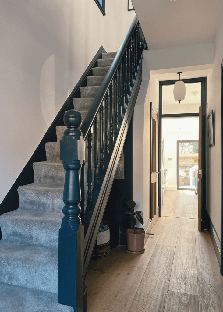
As a typical Victorian semi-detached house, the staircase is the focal point that greets everyone as they enter our home.
Hallway Design Inspiration
When I start a design project, I often look to sources like Pinterest and websites such as Studio McGee for inspiration. I’ve always admired Shea McGee’s use of dark colours and contrasts, creating depth and interest without overwhelming the space.
In our home, the goal was to capture the essence of our Victorian property while giving it a contemporary update.
Our hallway is north-facing, which means it has little natural light – it often casts a cool, shadowed hue. I initially experimented with Farrow & Ball’s Oval Room Blue, a shade that often works well in classic Victorian homes. However, in our narrow hallway, it made the space feel cramped and too dark.
The design challenge became clear: create a brighter, more inviting entryway that reflects the period architecture and modern family life.
Hallway Design Considerations
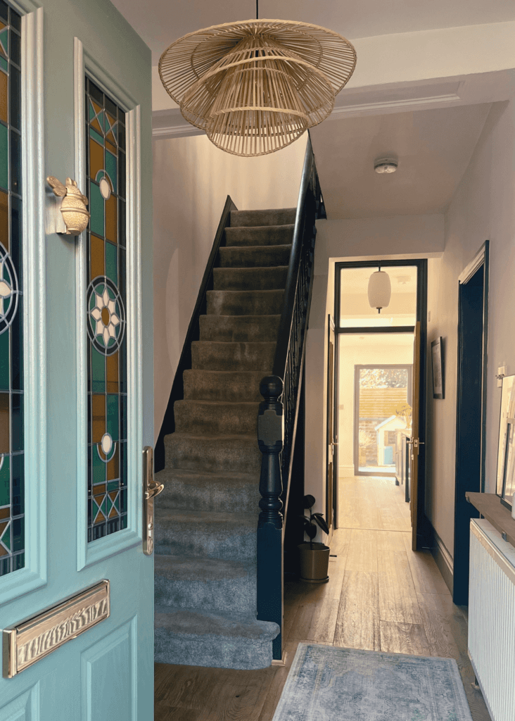
Designing a family home is always about balance. The hallway had to be bright enough to offset the limited light but also bold enough to make a statement. It’s one of the first spaces you see when you walk in, so it needed to communicate warmth, style, and our personality. Most importantly, the design had to work practically for our busy family.
Colour choice was crucial in creating this atmosphere. The colours needed to compliment our new front door, painted in Green Smoke by Farrow & Ball, with stained glass in shades of green, amber, blue, and pink—a nod to traditional Victorian style.
The hallway needed to enhance this feature while maintaining its own distinct personality.
It was important that the staircase felt cohesive with the Victorian charm of the house, but with a modern touch to reflect who we are as a family today.
Colours Selection: Creating Light and Contrast
After working my way through several paint samples, I made the final selections.
For the walls, I went with All White by Farrow & Ball. I love this shade of white! We also used this colour in our open-plan kitchen, and it creates a beautiful continuity throughout the home. In the north-facing hallway, it’s bright and crisp, helping to open up the space. In the kitchen, it catches the warmer light and creates a more inviting, lived-in feel.
For the staircase, the choice was between three darker tones:
- Railings by Farrow & Ball
- Green Smoke by Farrow & Ball
- Studio Green by Farrow & Ball
Winner: Railings
- Green Smoke, although gorgeous on our front door, felt too similar for the staircase. I wanted the hallway to have a distinct contrast, so this was ruled out.
- Studio Green had the depth I was looking for, but in the dim hallway light, it appeared murky and didn’t feel vibrant.
- Railings was the perfect choice. It’s a deep, blue-black shade that offers all the drama of a dark colour without feeling too heavy or traditional. The subtle blue undertone responds to the natural light, making it feel both contemporary and classic – a perfect match for our home.
Railings brought a sense of elegance and structure to the space while still feeling warm and inviting, which is exactly what I was looking for.
Elevating The Hallway Design With The Right Paint: A Sustainable Approach
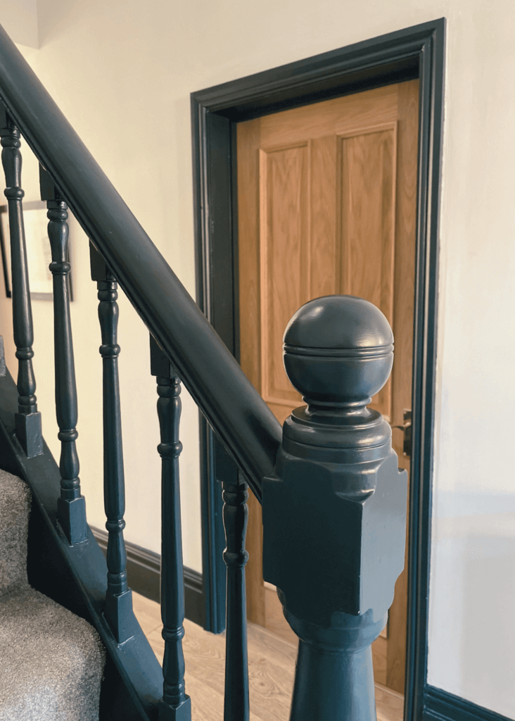
Many older homes have staircases and woodwork that are coated in oil-based paints. While these paints are durable, they contain volatile organic compounds (VOCs) – harmful chemicals that are released into the air as the paint dries. Not only are they bad for the environment, but they can also negatively affect indoor air quality, which is particularly concerning in homes with children or pets.
That’s why I always choose water-based paints, which are much kinder to our health and the environment. Yes, they are just as hard-wearing! The key is to ensure proper preparation before applying them.
Farrow & Ball’s Estate Eggshell range is perfect for interior wood, with a low sheen which adds subtle highlights. It is even wipeable and washable!
Farrow & Ball were the first in the industry to move to an entirely water-based range, while ensuring their finishes don’t compromise on durability. Read more about Farrow & Ball’s sustainability practices here.
Tip: If you’re painting over oil-based layers like I was, it’s essential to prime the staircase first. I also recommend asking your paint supplier to add a shot of dark pigment to the primer if you’re using a deep colour like Railings. This helps with coverage and ensures the final finish is flawless.
The Hallway Design Process
As with any interior design project, preparation is everything. Here’s an overview of my process:
1. Preparing the Space
As you can see from the above photos, the staircase had several old layers of paint (including an unusual red on one of the spindles) which required a lot of sanding. This step, while time-consuming, ensured the new paint would adhere properly and create a smooth, professional finish.
Next, I applied the primer using a small paintbrush to ensure an even application.
2. Painting: The Fun Part
- Bannister: I began with the bannister, using careful, even coats to create a sleek, polished look. Each coat needed ample drying time to achieve the perfect finish.
- Spindles: Painting spindles is notoriously tricky. I found that using a sock (yes, a sock!) instead of a brush worked really well for a smooth, even application. This allowed me to reach all the tight spots without leaving brush marks. More about this ingenious method here.
- Skirting boards: Since we have 2 small kids, we weren’t ready to replace the carpet. I used thick masking tape to protect the edges of the carpet, ensuring clean, sharp lines along the skirting.
The transformation took time, but every step was worth it. The result? A staircase that has truly become a hardworking feature of our home.
The End Result Of Our Hallway Design: A Positive Impact On Our Family Life
Interior Design is about more than aesthetics—it’s about creating spaces that positively influence how we feel. Since transforming the hallway and staircase, our family has noticed the difference. The once dark, unorganised space now feels welcoming and full of energy. The crisp whites and bold contrasts bring a sense of calm and clarity, making the space feel more energising.
The changes have also made a big impact on the functionality of our home. The kid-friendly nook under the stairs, with hooks at just the right height for our little ones’ coats and bags, has transformed a once-unused space into a pretty and practical part of our daily routine.
There’s something very special about walking into a home that feels both beautiful and functional. It sets a positive tone and creates a sense of balance and harmony. This transformation is a good reminder of how thoughtful design can enhance our quality of life.
Your Home, Your Happy Place
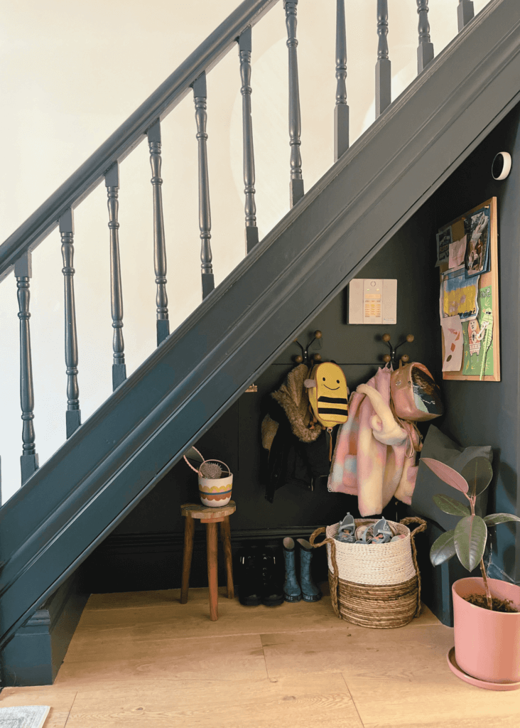
If you’re wondering if you should take the plunge and embrace a bold colour for a small or darker space, consider this your sign. Dark colours like Railings can actually elevate a room, adding depth and sophistication while maintaining warmth, especially when paired with a crisp white base.
This staircase transformation was only the start of our hallway design journey. In Part 2 of our hallway design, I’ll show you the design for our boot room area which has revolutionised our daily routine.
In need of inspiration or advice for your own transformation? I’d love to help you create a home that reflects your own style and lifestyle. Feel free to reach out and book a consultation!
Ready to create a space that truly supports your lifestyle and well-being?
Book a consultation to start exploring your vision.
If you’d like to see more of my approach or find inspiration grounded in well-being and design, stay connected by following along on:


